Terminal & Coin: the BoopBoop brand system
Why an enterprise treasury product is called BoopBoop, and how that tension became the design system: grave machinery, one light touch. The mark is now a machine-cut guilloché coin: same seed, same coin, forever.
BoopBoop is an enterprise treasury product with an internet-whimsy name. A boop, if you haven't met one, is the gentle tap on a snout.
Every fintech that survived this tension, from Stripe to Mercury to Ramp, resolved it the same way: the system is grave, the touch is light. So the brand is exactly that.
Terminal & Coin
The product is an operator console over contracts, text as authority. So the display voice is a monospace (Geist Mono), the surface is clean engineering paper, and the primary button is ink-black. Gold is scarce by law: the coin, the links, the yield numerals. Nothing else gets it.
The first attempt at this system was warm cream paper with a serif. It was pretty, and exactly the default every AI ships when asked for "premium fintech editorial." We killed it. Lesson: a rationale is not a look.
The mark is a machine
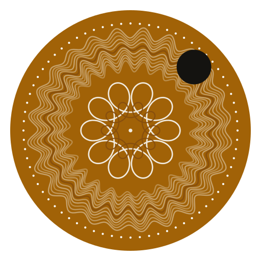
The logo is a guilloché coin: a weave of parametrically modulated rings around a seven-arm rosette, cut by a deterministic generator (seed 42: same seed, same coin, forever), with one small dot placed by hand at its edge.
The reference is deliberate. Guilloché is the engraving on banknotes: security print, complexity published on purpose so forgery becomes economically impossible. Policy as law is the same idea wearing a design system.
The kit is public
Symbol, wordmark, lockups, palette, typography, and the rules that keep them honest are all on the brand page, free to use with attribution.
Next step